|
PurePlastics |
| Submitted By Peter Simonsson (pss) |
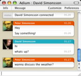
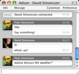
DescriptionA message style designed to be informative without being too cluttered.PurePlastics 1.2 Changes:
PurePlastics 1.1 New variants:
CommentsYou can reply to individual comments by clicking the "Reply" link next to each. # by Terr on 07/03/04 at 00:41:54I agree with Drunken link. I like the style, but some more color profiles would make it even better
# by Junpei on 07/03/04 at 02:25:02Yeah, this is a cool style! Some more color variations (though I like the Red/blue colors too) would be nice. I'd like maybe a lighter grey vs. a grayish-blue (graphite even?).
# by on 07/04/04 at 20:16:40i would like to see the bottom left corner rounded, i don't know why, but it peeves me.
# by Junpei on 07/05/04 at 00:28:46Very nice now with more colors. And the left corner /shouldn't/ be rounded as that would look very odd with shorter messages.
# by on 07/07/04 at 21:16:27very nice, however, could you make a variation where the buddy icons are 50x50 pixels? (So they don't get shrunk and look ugly, there's nothing worse than a scrunchy animating icon)
very nice, though. # by Nooon on 07/08/04 at 16:18:46Very very nice!
This is my favorite message view style. Great work! # by Karo on 07/08/04 at 19:28:24The format of the date is not accurate when using non-English formats. I get "8. Julyta 2004" when it should read "8. hein?kuuta 2004" (in Finnish). I would like to see the colour of the text in history to be greyish that it would not be confused with new session. If not considering these little deficits this one is a theme that pleases me the most.
# by pss on 07/08/04 at 23:07:09Thanks for the comments. 50x50 buddy icons wouldn't be a problem horizontally but it would be huge vertically, and each message would take up a lot more space than needed. As for the date formating problem... I have no idea. If anyone know how I can fix this, send me an email or something.
# by on 07/11/04 at 23:12:45Look at the right side of the messages in this screenshot:
http://filehost.mrbiiggy.com/crap/...plastic.jpg Am I the only one with this problem? I love this message style, but it's really annoying to see that all the time. The only thing I can think that could be a cause to this is maybe because I have Safari 1.3 installed? Awesome message view style, anyways. # by pss on 07/12/04 at 13:08:52Weird... I don't have that problem here, and haven't seen it on any other machine either. If it is Safari 1.3 that's causing the problem, I'll fix it as soon as I have the update.
# by thejokell on 07/15/04 at 17:08:40Finally a message view that is good enough for me to replace Mockie. Kudos to you, pss.
# by Rachel on 07/15/04 at 18:52:59I love this gorgeous message view - it replaced Mockie for me, too. The only thing I don't like is the gray box when a user doesn't have a buddy icon. It's a little...creepy, or something. I'm not quite sure why, but it really rubs me the wrong way. I wish there was like a "default" icon that would be there if the person has no icon, like the gray duck in Mockie.
# by Sebastian Civarolo on 07/17/04 at 16:14:52I tried installing the theme but it doesn't seem to install.. It tells me it was successful.. but it doesn't show up in preferences
# by on 07/24/04 at 00:20:15Weird... I don't have that problem here, and haven't seen it on any other machine either. If it is Safari 1.3 that's causing the problem, I'll fix it as soon as I have the update.
Hah! it was Safari 1.3... I reverted to 1.2 and the problem is gone :) # by Union on 08/15/04 at 19:25:46This is a great style. It's replaced mockie for me. The only complaint I have is that the color descriptions aren't accurate. Red is more orange, blue is more aqua, green is more neon yellow. It'd be nice if they the colors were more accurate, but still a very, very good message view.
# by on 08/24/04 at 05:49:49What the heck is the difference between the ones labeled "top info" and those that aren't?
# by on 09/02/04 at 23:28:55Another convert from Mockie. This really is a slick piece of work, even if I'd rather have a slightly less turquoisey blue - and yes, I'm nitpicking ;o)
# by on 10/05/04 at 04:21:21I really like this theme. I'd like it more if there was an option (i guess more variations) to enlarge the display pic of the people in the conversation. The default MSN pic is much bigger than what it shows currently and I can hardly make out the detail of what my friend are putting in there.
# by bob_the_gorilla on 10/20/04 at 03:57:13I've just finished modifying this style (with permission) and my version, by coincidence, can be viewed both without buddy icons, and with a header showing full-size icons. I hope Peter doesn't mind if I plug it here! :)
http://adiumxtras.com/index.php?a=xtr...xtra_id=705 # by skram-da-lam on 11/30/04 at 07:30:01I love! just the way it is ;) plain and clean! maaaybe som aqua on the nick bar or something... ;)
# by Adrian on 03/06/05 at 22:37:37The most stylish of all message views - I can't find any better! The greyscale one is perfect for all occastions! Though I can agree that one might want more (or different) color modes.
Summery: Nice! # by jon on 03/11/05 at 22:55:07I really like this style its my favorite, I use it all the time, as for the other colors, I really like to have some shinny metalic colors :)
# by on 03/12/05 at 05:45:51Superb style. My favorite so far. But I do agree with a previous poster who pointed out that the edges of each message should be rounded more. They are somewhat pixelated right now.
# by pss on 03/13/05 at 14:12:32Thanks for the comments. Sphexus: I'll probably fix the rough edges for the next update. Matisfaction: When you have the icons on every message there's no reason for them to be full sized... they're just there to make it easy to quickly see which message belongs to who, without reading the name. If the icons are any bigger they will be in the way of the conversation.
# by on 03/18/05 at 18:48:07hey pss, great job with the PurePlastics! Is their any way that we could get some screenshots of the new 1.2 version and some of the color varients? thanks.
# by on 03/28/05 at 00:45:04I've been using PurePlastics for a while now, and I'd love to see it's sitting-on-window style without any backdrop. It'd be cool if the Adium developers would maybe be able to do something in the way that Apple employs dashboard, and make the entire chat window CSS-able.
Hah I probably shouldn't be posting this here, but awesome message view none the less! It should come default. # by on 04/22/05 at 14:48:36Regarding the problem with the right side and Safari 1.3. It seems to fix itself once you resize the message window. Close the message window and re-open and it will do it again. It's the resizing of the window that seems to fix it. This is a great Message Style. Keep up the good work!
# by on 04/24/05 at 21:19:51This is a great theme, except it breaks down with MSN contacts with long screen names. The end of the name wraps down to the line below and obscures the message text.
This is a problem I've found with many themes. I suppose I can attribute it to most people not using MSN, but it severely limits your theme choice if you do use MSN> # by Skunkie on 11/10/05 at 02:10:07I would just like to toss in my appreciation for this theme. :) A neat feature to add would be alternating left and right buddy icons. I don't think any of the Plastic themes do that. Either way this is my favorite theme for my current desktop. Thanks!
# by MizterG on 07/25/06 at 16:12:36Could you make this so it supports background message colors? There's an option to turn off "show received message colors," but it doesn't seem to work correctly with this message style. Foreground colors show no matter what, and background colors don't show at all.
Annoying with colors like white and yellow. :) # by jpfeffer on 12/08/06 at 04:23:02i really like this - but i am having one problem. every now and then instead of just going to a new line with text that is a little too long for the box, a scroller bar enters the screen but doesn't seem to serve a function. does anyone else have this issue?
Post a New CommentYou must be logged in to post comments. |


# by drunken link on 07/02/04 at 22:50:52