|
Brainbyte |
| Submitted By Audun Wilhelmsen (skyfex) |
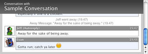
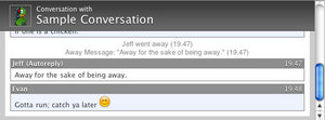
DescriptionThis message view is based on a design for our upcoming website. It's quite simple and lightweight. It has 5 variants.
CommentsYou can reply to individual comments by clicking the "Reply" link next to each. # by Brutal on 01/28/05 at 10:40:45Finally someone releases a message view! It's been a long time since the last release :)
Great style btw! # by Katha on 01/30/05 at 20:37:49That's a real good one. Maybe you can center the emoticons in the line?... Dunno... hope you know what I mean lol
# by MBHockey on 02/01/05 at 04:00:44one small problem -- it seems whenever someone doesn't have a buddy icon, it displays that annoying blue question mark box for the avatar in the header...can you change that to something else? Or tell me how to do it?
# by on 02/03/05 at 22:34:44Great stuff. Regarding the blue question mark issue - maybe using the generic Apple question mark instead (the one you see when an app is missing from the dock, etc.), or that question mark with a greyed-out icon of the service in question behind it. Also, is it possible for the grey bar at the top to extend lower with longer sign-in names (re: MSN)? Currently, the text continues down overlapping the dialogue, while the bar remains the same size.
# by Audun Wilhelmsen on 02/06/05 at 13:24:52I'll fix the problems you mentioned for the next release. Can't give you any date for that though.
-Question mark buddy icon (wasn't supposed to be like that) -Center emotion icons -Fix for long names I don't have the last problem because I have an alias for all my contacts. I hate those looong nicknames with useless information or emotion icons. The name should either be your real name or a nick name. God. I wish MSN had a status field like AIM. # by Adrian on 03/06/05 at 22:41:27I'd like it if you could change the white background behind the message "bubbles"...
Post a New CommentYou must be logged in to post comments. |


# by on 01/28/05 at 00:10:21
Btw, I didn't like just one thing, the white color outside the messages, so I've just changed the css to have it in #CCCCCC in de chat class, I think that it look better for me like this. But it's only a preference of mine. Good work.