|
New Modern View |
| Submitted By Michael Moen (MichaelM) |
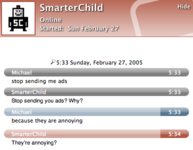
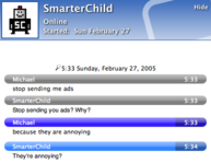
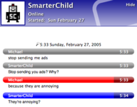
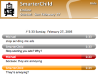
DescriptionA port of New Modern View from Proteus. Originally by Justin and updated by gcastro. Doesn't currently update the header for status changes, this may be implemented in a future release of Adium.The shots shown are the glassy version, there are also flat versions of all variants. v1.1: fixed a problem where followup messages would sneak under the date.CommentsYou can reply to individual comments by clicking the "Reply" link next to each. # by Anonymous on 03/01/05 at 22:50:44Can i put in a request for you to port Renisance :-) PLLLLLLLLLLLLLEAASE!
# by danielgrenell on 03/01/05 at 23:01:17i like it, but the graphic used in the upper right and corner isn't really to my liking. still a very nice message view though.
# by gottacoppafeel on 03/02/05 at 15:58:47the graphic is supposed to be a speech bubble, but it would be cool if was changed into an adiumy head silhouette, no? i think it would look kinda cool
# by MichaelM on 03/03/05 at 01:26:03Here's the thing, or things as the case may be... I know people would like to see the graphic changed and I'm all for it. But somebody else needs to step up for that part. I'm a developer and my design skills suck. Also, the graphic in the header changes based on status of the buddy on the other end. Well at least in my version ;) I submitted a patch to add that functionality for .8 not sure if it will be accepted.
# by MichaelM on 03/03/05 at 01:26:47Which version of Renisance are you looking for, I think there are like 3 of them... send me an email and I'll see what I can do.
# by gottacoppafeel on 03/03/05 at 20:47:02i put in a request for a port of "Skyward with New Modern header 1.1"...i believe you made this for proteus at my request as well as this one for adium. thanks michaelM!
# by The_Tick on 03/04/05 at 19:18:51I was discussing this on irc with others. I removed the comments that were meant for just humor, figured the rest could actually be useful. Here ya go:
1) huge 2) so much space 3) very hard to read 4) colors combos all suck 5) it has a "in message control" 6) the color combos make some things really hard to comprehend in a speedy fashion 7) the time stamps are hard to read on some 8) it looks like a crayola box on crack 12) is this purple.. or dark blue.. or periwinkle for "michael"? http://adiumxtras.com/images/pictures...mg_1623.png # by MichaelM on 03/04/05 at 20:25:41Hey thanks The_Tick, I know you are trying to be helpful. Considering that this was a port of an exixsting view from Proteus and I have stated numerous time that I am NOT a designer... Since all people can do is bitch about the colors instead of stepping up to provide things they feel would look better, I will stop providing views. If anybody wants to take the ones I have provided and maintain them, please feel free. Don't get me wrong I'm not offended, I know the colors suck, I don't make a living making pretty colors.
# by The_Tick on 03/04/05 at 23:05:28I was just making comments, I hadn't even read the others. If you want you can aim me and we can work on color combos. I'm not much better at it though.
Don't give up man, everything gets criticized. # by on 03/05/05 at 16:10:17This is my new favourite message view style! I'm a fan of the blue and brown flat style. If I knew how to do it, I'd make this in a zillion different colours, especially pink. But, alas, I do not know how. So I will stick with the awesome blue and brown. Thanks a lot!
Post a New CommentYou must be logged in to post comments. |


# by spacemanspiff on 03/01/05 at 02:17:56