|
Pro |
| Submitted By Sean Wolfsoap (Wolfsoap) |
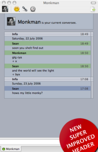
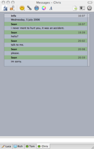
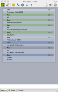
DescriptionPro Message Style emulates the appearance of Apples high-end video/sound editing pro applications.Changesv1.3- Variants. All the colors of the rainbow, dulled to perfection. - 'No Buddy Icon' icon added. v1.2 - You get better head, with the new header. - Darker, more felicitous link colour. v1.1 - All the ruff edeges have been sanded down and anti-aliasd. [Suggestions and improvements welcomed.] CommentsYou can reply to individual comments by clicking the "Reply" link next to each. # by ispytonyv on 07/15/06 at 11:42:41always nice to see something completely different come out... i've been teaching myself final cut, and i really like how well this captures the mood of the pro apps! you should definitely do a contact list color/theme combo to match!
# by ispytonyv on 07/15/06 at 12:02:45also a suggestion- the "(name) is your current conversee" i think would be better as a constant header, instead of scrolling up as the text rolls in.
# by Wolfsoap on 07/15/06 at 16:30:44Thanks. `ill do that with the header (I have mine turned off). Im also going to put buddy icons in there, some how, it'll be hard to get the look right though. Glad you like.
# by ispytonyv on 07/15/06 at 17:28:21yeah the user icon appears fine for me in the header so i hadn't thought about them in the actual message view, it's just that instead of being fixed at the top it moves out of sight as you're talking... or is already out of site when you have message history turned on to show previous lines of conversation. as a side note, when you click on the circular blue "i" icon next to the user's icon in the header, it changes to large text that reads "Shiny Info Button." it'd be nice if that was either disabled or served some actual function. good work so far!
# by csquared on 07/27/06 at 18:46:23Clean, simple, and functional. Nice work.
Minor quibble which should be fixed in the next update: If the conversee doesn't have a user icon, it shows up as a broken image (question mark in a blue square). I also agree with ispytonyv regarding the constant header; if you can do bothone variant where it's a constant header, another rendered as it is nowthat would be great. Some other palette options would also be a nice addition. # by switchr92 on 07/31/06 at 13:39:11Sean, this message style rocks. I don't use pro apps, but its easy, simple, just awesome. Guys, you want an attractive, simple message style, this is definitely the one you need. Thanx so much!!
# by drock on 08/13/06 at 12:33:09I like it, but why is there so much space between the edges of the message box area and the edge of the window? Is there any way to eliminate or lessen that extra space? Is it there for a reason? To me, it just seems like some wasted space that could be filled with the message box area, but I could be wrong.
Also, when I open a new conversation window, the colors in the message window revert to Graphite-Cobalt until I open up the preferences and reselect the colors I had chosen. The drop down list stays at the name of the colors I had selected, even though they are not showing up properly in the window. Once you get that fixed, could you make a GreenMix-Cobalt variant? Thanks, and I hope my input is helpful rather than annoying. # by fissure on 08/13/06 at 18:19:21Pretty. I think it would be useful to have a variant where there is very little or no margin around the message box.
# by mediumofmeaning on 12/20/06 at 16:22:42like the theme. too few on adium like this. have a few issues with spacing, though. sides, after last message, etc.
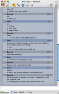
# by BlackandWhitePenguin on 01/03/07 at 02:54:17I love this...but I hate the little pluses. These has got to be a more graceful way to handle it. If not for those I would use this theme.
# by peelman on 08/10/08 at 20:43:17Ditto on the Pluses. I went in and modified my copy of the theme to use '¬' (alt-L) instead. I like the idea, just not the '+'s.
# by hfs on 10/21/08 at 04:08:39two things: for some reason none of the colors work, and i cant disable the header
the other thing is the pluses are really unnecessary. it'd be perfect without them, just keep all the lines the same font size, too. otherwise awesome theme. # by evangw on 01/28/10 at 23:32:25Thanks for making this, Sean. It's by far my favorite theme, and I think I've been using it for at least 3 or 4 years now.
One (big) problem though: I can't change the Text Display font size. I can change the number, but it doesn't change the size of the text in the window at all. I've had to switch to a different (and less appealing) message style in the meantime, since font size 11 leads inevitably to eye strain on a 27'' iMac. Post a New CommentYou must be logged in to post comments. |


# by Kestrel on 07/14/06 at 14:42:49