
|
1337 |
| Submitted By Ayumi Yonosa (yonosa) |
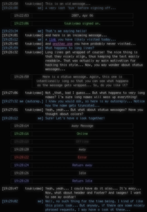
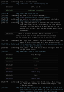
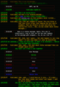
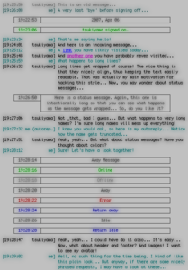
Description1337 Adium message style
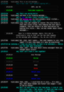
Inspiration The look of the "1337" message style is inspired by the h4x0r message style (hence the name) by phrenzy from previous work by Mark Fickett. See this page for the h4x0r style. Disclaimer This is my first attempt at style design. Things are probably a little rough... But anyway, comments/suggestions are welcome. Credits A special "thanks!" to Catfish who helped me to sort out bugs and find workarounds. Arigato gozaimasu! License Now, what about the license? Well, given that there is no real code involved (this is basically just a CSS anyway!), talking about license is probably overkill. So, let's just say that this style can be freely distributed, modified, tortured, etc. Credit would be nice, but I don't necessarily require it (but maybe that phrenzy and Catfish do! So check with them just in case...). So, here you are, hoping that someone, somewhere, at a given point in time, will find it useful, or at least, worth of downloading "just to have a look". Misc. notes Adiumers (adiumists? :-) using a HH:MM:SS (AM|PM) formatted date field should use one of the "Wide" style variants, introduced in version 0.1.2. Changes
CommentsYou can reply to individual comments by clicking the "Reply" link next to each. # by Seeq on 03/27/07 at 13:28:54Awesome style, but I can't set a custom background so it can be transparent.
# by l355thanz3r0 on 03/27/07 at 15:13:13when i install it and try to use it it just doesnt show up right period. When i pull up a previous conversation it leaves a little white space at the bottom above the text area and when i open a brand new one the whole window is white and nothing appears when typed. i love the look of it though, very well done
# by yonosa on 03/27/07 at 15:55:11I never log my conversation so I did not test that. Probably just a padding or margin mismatch. Should be easy to fix.
As far as the empty white window is concerned, this is something that I can't reproduce here (works well for me). Are you using a special background? What font are you using? Can anyone confirm this strange behaviour? Thanks for your feedback l355thanz3r0. Ayumi # by atticus04 on 04/01/07 at 20:26:18Love this message style, but I'm having margin issues too. All of my settings seem to be pretty standard too.
# by atticus04 on 04/01/07 at 20:30:14To be more specific, mine aren't exactly the same as those described above. I don't know the Adium lingo too well, but in the conversation area, each line of text tabs over one space.
I'm just going to try to take a screenshot. # by yonosa on 04/03/07 at 06:02:31Very interesting indeed!
I'm sorry but that's your own fault! You should use a 24 hour clock, or, as Americans put it "military" time! Just kidding of course... Looking at your screenshot, this can seem pretty bad, but the fix should be trivial. I'll have a look into the matter. You can look forward for an update soon. Thanks a lot for your feedback! This is really appreciated. Cheers, Ayumi PS: Oh, and as an aside, the 1337 style is really meant to be used with monospaced fonts. But I don't think it should be much of a problem otherwise... Just try to avoid Zapfino, 'kay? :-) # by yonosa on 04/03/07 at 09:07:12Okay Atticus, here is an updated version of the 1337 style with "Wide" variants that should be used if you prefer 12-hour clock format (with seconds).
This is not a quite elegant solution, I agree. But making sure that everything is properly aligned (while always using the same field widths across different messages) taking into account the various date formats and non-proportional fonts is not that trivial (if you don't want to waste too much space, that is...). So I guess that for now, this will do the job. let me know should you experience further issues. Cheers, Ayumi # by l355thanz3r0 on 04/03/07 at 20:43:24i think if you could add a buddy icon in the top right corner, like in haxor, this would be the perfect style.
# by yonosa on 04/04/07 at 07:14:02Hmm... I guess I can do that... Actually I have plans for header and footer but maybe they are a bit too ambitious. I'll see how it will turn out once I had some time to work on it. So, the answer is that, yes, buddy icons will be added, but I probably won't do it this week... and since I'll be on vacation next week, this will have to wait a tiny bit.
As an aside, what about the layout problems you were experiencing earlier? Could you provide more explanation or, even better, a screenshoot? Thanks again for your feedback, Ayumi # by haunted_i on 04/12/07 at 14:17:56Too bad more styles (or other apps) don't make use of that text glow feature built into OS X. You've tweaked it nicely.
Just a technical note for anyone... when using Monaco (which lacks variants like bold or italic) and someone messages you with formatting, those characters will revert to another font like Arial. Not a bug, just how the OS handles things. Hopefully this answers a few questions before they're posted. # by fullmana_sba on 04/12/07 at 21:19:54This is an awesome style, I love it, but I'm having a problem with it, and need some help. No matter which variant I use, my typing is always in black, which is really hard to see with the dark variants. Messages that I receive are always the correct color (shown in the preview pane in peferences). I've tried changing the font color to match, but it doesn't stay set. I've tried returning everything to deafault settings, that doesn't work. I've tried changing what the default is, that doesn't work either.
thanks # by yonosa on 04/17/07 at 17:39:02Hi there,
back from my Spring break. Your problem cannot be replicated on my machine, but I will need to spend some time investigating it. IIRC, some other message styles exhibit this strange bug. Could it be an application wide setting that is bypassing the 1337 style's values? I'll have a look sometimes this week. Cheers, Ayumi # by fullmana_sba on 04/21/07 at 15:07:09That's possible. I'm noticing that any theme I try, my text is always black. I've fiddled with every text setting I can find and reset the plist, and it's still black. Any Ideas?
thanks # by df0notfoundNeue on 04/13/07 at 19:08:42Looks rather nice :)
Heres an idea, go look at the user themes page of the Textmate wiki, do some in colours off there. # by jhimm on 05/16/07 at 13:18:26My only confusion/criticism of this skin, which I really love aesthetically, is that huge space between the time stamp and the user ID. I don't see any way of removing it, I'm not sure why it's there, and it squishes all the test in my windows way over to one edge. What's the deal?
That aside, this is brilliant :) # by jhimm on 05/16/07 at 21:33:22d'oh! that should say "... and it squishes all the teXt in my windows..."
# by yonosa on 05/25/07 at 07:05:01Well, the gap is here to properly align the names. The gap size tries to account for possible long names, to avoid too much truncations... Oh, and I guess that you're using proportional fonts. Am I right? :-)
I don't really now how to solve this, except maybe by providing narrow variants... Ayumi # by jhimm on 05/25/07 at 11:54:08no, i'm not using a proportional font. what would be the point of using a terminal emulating message window with a proportional font?
anyway, the haxor message window that inspired this one doesn't have a huge space gap like that. the datetime stamp and the name are in separate segments like this [datetime] whereas yours are like this [datetime name] it just might be nice if there was one sub-variant that didn't do that for those of us who like to use smaller messaging windows, because it really does end up cramping up the text pretty considerably. but i -really- like this style otherwise. its quite sharp. # by yonosa on 05/29/07 at 14:43:21> anyway, the haxor message window that
> inspired this one doesn't have a huge > space gap like that. the datetime > stamp and the name are in separate > segments The h4xOr style does not align the messages. Again the gap you dislike so much comes from the fact that I wanted to have the messages aligned. (I'm talking about multi-line messages of course). So, there is not much I can do about that gap, unless maybe trying to reduce it a little bit, but if the contact names are not the same length, such a gap wil still appear. I'll try to have that gap narrowed but it is not on top of my priority list for the time being... > it just might be nice if there was one > sub-variant that didn't do that You mean aligning the messages or putting the beginning of the messages right after the sender names? Because aligning the message would of course be way easier to align if one allow for a line break... And a gap would not be needed then... Anyway, I'll see what I can do when I'll resume working the this message style... Ayumi # by jhimm on 05/29/07 at 22:24:10haxor looks like this (from the preferences example text):
[1:47] ... thus negating all existence! [1:47] Precisely! it's a risk one takes whenever one walks into a bar, I'm afraid, especially if one is a chicken. l337 looks like this (the same example): [1:47 Jeff] ... thus negating all existence! [1:47 Evan] Precisely! it's a risk one takes whenever one walks into a bar, I'm afraid, especially if one is a chicken. i don't really know what you mean by aligning messages. i'm just saying that i prefer this: [1:47] to this: [1:47 Jeff] if you want to avoid using the 's maybe do this? [1:47][Jeff] for me, not having the conversation crammed against the right-hand side of the window is more (way) important than having the names lined up. i didn't expect it to be a priority, it's just a request. so many aspects of these things are customizable within the context of a skin, and that's one bit that isn't, so i have to make the request. # by yonosa on 05/30/07 at 06:23:35> haxor looks like this (from the
> preferences example text): What about the contact names? Do they not appear? Is that an option that I somehow missed? > i don't really know what you mean > by aligning messages. Well, have a look at the provided screenshoots. Particularly the line by tsukiyama at 19:26:32... That's what I mean by having the messages aligned.... It seems to me that you are considering the names of the sender to be part of the message block, whereas I do not, so maybe this is the source of our misunderstanding... > i didn't expect it to be a priority, it's just > a request. so many aspects of these things are > customizable within the context of a skin, and > that's one bit that isn't, so i have to make the > request. Sure. As I said, I'll have a look, maybe this week-end... As an aside, did you notice any problems with the way names get displayed (gap aside)? One post complained that the Ecmascript truncation function was not properly executed... Cheers, Ayumi # by jhimm on 05/30/07 at 10:20:24ugh, it interpolated the way haxor does the names and so they didn't show up in my post. i'll use another symbol instead of angle brackets, but know that the haxor skin uses angle brackets around the names.
haxor messages look like this: [1:47]jeff ... thus negating all existence! [1:47]evan Precisely! it's a risk one takes whenever one walks into a bar, I'm afraid, especially if one is a chicken. and yes, i understand why you are putting the large gap into your lay-out. i just wasn't 100% sure that aligning the names and aligning the messages was the same thing, hence my confusion. i am not considering the names part of this or that or the other thing. all i am saying is that including that huge space to accommodate potentially long names means that my messages get crammed all up against one side of the window and makes them very hard to read (for example a one line response can end up on as many as three lines). i have no idea what an Ecmascript truncation function is, so i can't help you there. # by Kit on 05/20/07 at 19:17:24I have a slight issue as well. Thise theme does not appear to show the usernames. instead, it appears just like this: "[4:09:04 PM function (match, substr) { return truncate(substr); }]" followed by the message. It appears like this for when I get messages, as well as my responses.
It was kind of neat at first, but I cant figure out any setting to set that will actualy display the user names. That is, if it is a setting, and not a neat little glitch in the code. ^_~ # by trebe on 08/14/07 at 23:59:11ah nice! I was using h4x0r for a while until I got sick of the colors. Tried to change the colors myself, it got all messed up (guess I wasn't 1337 enough, :p). Thanks for the colors!
# by trebe on 08/15/07 at 00:04:10EDIT: Guess I spoke too soon. There's a huge blank space between the time and the user's name. Back to art hero for now...
# by yonosa on 08/27/07 at 07:55:05Well, this wide gap seems to be an issue for quite a lot of people. On my computer, using the Monaco font, the gap is not that large but I understand that it is still a problem for some of you.
Unfortunately, this gap is more of a design choice than a bug... Indeed, I wanted to have the message properly aligned. (See my discussion with jhimm on this very topic) I promise to have a look at the matter and I'll try to come up with a better solution than a fixed, hard-coded gap width. But that won't be for right now as I'm pretty busy with other stuff right now. Thanks for having given 1337 a try though! Ayumi # by mathuaerknedam on 04/09/08 at 10:45:03Yu may be interested in looking at yMous. It uses tables to keep column widths consistent through a chat windows while automatically scaling the column width for the widest screenname (up to 10em) or for whatever date format is used. Feel free to take it apart any apply any techniques to 1337. :)
# by flipmess on 11/07/07 at 20:39:02Awesome style... Thx a lot! If you're still working on this style would it be possible to add the service name (icq, aim, msn) in the initial conversation? I have a lot of meta contacts so it would be very helpful.
flip # by yonosa on 11/08/07 at 17:59:28I promised some time ago that I'll update the style with some bells and whistles. It's been a while since I've not work on it... I'll try to come up with something before Xmas.
Ayumi # by flipmess on 02/04/08 at 19:35:14Any news? ^^
# by yonosa on 02/07/08 at 20:38:41Lol! Well, actually, it's been a while since I had a look at it. Do you have any precise suggestion or request that could get me started on something?
Cheers, Ayumi # by flipmess on 02/11/08 at 17:50:46Only one thing: some styles, like iphone.adium.message.style have in content.html in incoming and outgoing folder something like "%service%" so that one can see what protocol is being used atm. This is imo very useful when you have many "meta" contacts which use different protocols. This is the only thing i'm missing. Thx for your time! n_n
# by Xjs on 05/17/08 at 16:33:36Like it *very* much. (Although I wouldn't want to be called 1337 ;-))
# by theseethrumirror on 08/17/08 at 22:51:54I enjoy this so much! This style is so awesome. Amazing color choices. I only have one suggestion: I just wish that it showed my full name and their full name instead of cutting it off and putting a period at the end. Is there any way to change that?
# by yonosa on 12/15/08 at 18:30:29Open the file 1337.AdiumMessageStyle/Contents/Resources/Template.html and change the line:
var maxlength = 12; to something like var maxlength = 24; or more depending on the number of letter in your name. Also, use one of the "wide" variations. But I think things will look quite messy since what I wanted to do with this theme was to have properly aligned messages. So anyway, try this at your own risk! Oh and by the way, when was your message written? August 2008? Oh well... better late than never? :-) Cheers, Ayumi # by mathuaerknedam on 12/19/08 at 15:25:53Regarding the column alignment, you may want to reqrite the style to that columns are sized automatically. Feel free to check out yMous to see how it's done.
# by manny on 05/20/09 at 18:14:12Its so pretty, but it's not so user friendly if i'm using it with the new beta 1.4 that support the IRC. Indeed every user different by me, will appear like the same user and not with a different colour. Is possible to add this feature so useful in IRC?? Thanks!
# by azande on 07/27/09 at 02:00:21Great skin, especially the Negative narrow.
Can anyone suggest a contact list that matches the look of this? # by pixelologist on 07/28/09 at 00:33:10I love this theme - thanks for all your work on it! Next to just the look of it, the alignment of messages is a wonderful thing and gives the theme that extra fit and finish that takes it over the top.
# by Noyasoft on 09/25/09 at 08:05:27Hi,
I love this theme! Is there any way for me to right align the text? (the text that I'm writing and receiving within the chat window). I have no knowledge in css but if someone here could point me to a file and the needed change I could edit and modify it. Thanks :) # by yonosa on 09/28/09 at 20:16:26I'm not sure I understand what you want to do. Do you want to merely justify the
text (i.e. left and right align it)? Or just having it right aligned but ragged-left? Anyway, you'll have to edit the file: 1337.AdiumMessageStyle/Contents/Resources/main.css to change: .outgoing .message { text-align:left; to: .outgoing .message { text-align:right; /* or text-align:justify; depending on your needs */ Of course, you'll have to do the same thing for: .incoming .message And: .contextincoming .message .contextoutgoing .message while you're at it. Hope that helps, Ayumi # by Faycop on 12/09/09 at 01:22:37Hi nice skin buddy :) I've just one question: I'm developing my own skin, and how did u do to resize the name and putting a dot if the name is too large? how did do this cool name-shorter action? :)
Thanks and bye! (of course, I'll thank you in the credit :D) # by yonosa on 12/09/09 at 13:54:03Hi there!
I added a very simple ECMAScript function called truncate (how original) in the Template.html file. This function is then called in the appendMessage function to replace a temporary place holder by the truncated name. Have a look at the Template.html file. It's all in there! Cheers, Ayumi # by eduardoduccigne on 12/06/11 at 20:47:15Hi guys,
I was wondering: is there any way to change the "type bar" in order to match the theme style? This screenshots explains better: http://cl.ly/3y2e3i3U350h3q051q0T By the way, congratulations! Post a New CommentYou must be logged in to post comments. |





# by Cortez on 03/26/07 at 22:27:44
NICE!