|
textonly |
| Submitted By Mark Fickett (Perez) |
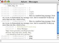
DescriptionText-only view, with variants for grays, status colors, name colors, and full color (status and names).2005 March 25: Updated due to consecutive status messages not appearing (bug fix). 2007 Oct 27: Updated for Leopard. (Specified font-size for times/names as .8em, and switched from having the #Chat margin-bottom at -10px to having the padding-bottom at 10px.) Download also available at: http://www.markfickett.com/stuff/artPage.php?id=393 ImagesCommentsYou can reply to individual comments by clicking the "Reply" link next to each. # by greensubmarine on 07/06/04 at 15:46:23Very nice. As stoic as it gets, and all the better for it.
# by Berry on 10/17/04 at 05:18:10I made a modification of this one which has all text as the same font, which I think is simpler and more elegant. However, it's nice to see a relatively simple message style instead of one laden with a billion borders and graphics.
# by on 05/04/05 at 14:38:27this is exactly what I want -- no extra junk, just text. But this 8-pt. courier font is unreadable. How can I change the font to my default Adium font (Lucinda Grande 12-pt.).
Also, I'd like to get rid of the times, but the font is the most important thing. Thanks! # by on 05/04/05 at 19:54:15Eventually people will realize simplicity is the key in HCI. Especially in today's online, traffic-dense personal information systems.
This is my theme of choice. # by ~Niko on 10/31/07 at 02:35:45I'm sorry, I find this an eyesore. Just my opinion. The time stamps are unnecessary and too long, and the screennames (with the time stamps) seem to push messages out into a nearly half-window length indent. Could be better... perhaps putting the messages BELOW the name/time rather than inline?
Post a New CommentYou must be logged in to post comments. |


# by on 05/14/04 at 01:45:44
On the plus side, this works very well for those who like to use their own fonts, sizes, and colors.